5 Social Security Charts That Should Have Congress Worried

Image source: Flickr user Florian Schwalsberger.
For America's more than 40 million retired workers currently receiving a Social Security benefit, there may be no more important issue this election than the programs' survival over the long-term.
The program is designed to provide a financial foundation for lower-income workers during retirement, and according to suggestions from the Social Security Administration is expected to replace about 40% of a retirees' working wages in their golden years. Unfortunately, the future of the program is very much in flux, and lawmakers on Capitol Hill have been unable to come to an amicable consensus on how to fix said problems. However, if we were to examine the latest Social Security Board of Trustees report, as well as data from Gallup's most recent national poll on Social Security, the severity of Congressional inaction comes to light.
Here are five charts illustrating just how important it is that Congress resolves the problems tied to Social Security sooner rather than later.
1. Demographics shift
Excess cash reserves. Image source: Social Security and Medicare Board of Trustees 2015 annual report. OASI = Old-Age and Survivors Insurance Trust; DI = Disability Insurance Trust; HI = Hospital Insurance Trust.
According to the Social Security Board of Trustees, the Old-Age, Survivors and Disability Insurance Trust is slated to exhaust its cash reserves by 2034. It's important to note that this doesn't mean the program would be insolvent, but it would imply that benefit cuts of up to 21% may be needed to offset the lack of adequate payroll tax revenue being brought in.
There are two primary reasons behind the exhaustion of the OASDI's cash reserves. First, baby boomers are retiring at a rate of about 10,000 persons per day, and will continue to do so for the next 15 years. Having more retirees to pay benefits to means the worker-to-beneficiary ratio is expected to fall from 2.8-to-1 as of 2015 to just 2.1-to-1 as of 2035. In easy-to-understand terms, there just isn't enough revenue being generated from new workers to offset the large number of retiring boomers.
The other reason involves people living longer than ever. Based on data from the Centers for Disease Control and Prevention, life expectancies have risen nine years since 1965, and the average 60 year-old will live around 21 years today. Living longer is great news for seniors and their loved ones, but it's a strain on the already beleaguered Social Security program.
2. Expected reliance is growing
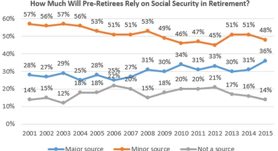
Chart by author. Data source: Gallup. Numbers may not add to 100% due to rounding and exclusion of "no opinion" respondents.
Now here's where things really start to get scary (as if the program potentially facing up to a 21% cut in benefits wasn't terrifying enough).
National pollster Gallup has been regularly surveying pre-retirees since 2001 to analyze how much of their income they expect Social Security to provide during their golden years. As you can see above, a worrisome trend has emerged. Over the last decade, the number of respondents expecting Social Security to be a major source of income in retirement has jumped 11% to 36%. Meanwhile, those not expecting Social Security to provide a meaningful percentage of income in retirement has dropped from 22% to 14% over the same time span.
What this implies is that baby boomers and other pre-retirees are counting even more on Social Security income during retirement, and additionally that quite a few respondents may not have enough in savings to cover their long-term retirement needs. That's scary when you consider that a benefits cut could be coming.
3. Current reliance is growing slightly, too
Chart by author. Data source: Gallup. Figures may not add to 100% due to rounding and exclusion of "no opinion" respondents.
Over each of the past 14 years Gallup has also surveyed current retirees to get a feel for how much they've come to rely on Social Security income. Although the pattern above isn't as easily discernable as with pre-retirees, what we are seeing is a modest downward trend in seniors who don't consider Social Security to be a source of income reliance, and a very modest uptick in those who consider it to be a major or minor source of income.
It's tough to say with any certainty what's caused this shift, but my suspicion is with baby boomers beginning to retire in greater numbers earlier this decade, and some entering retirement with inadequate savings, we're seeing this reflected in Gallup's data.
4. Americans remain genuinely worried about Social Security
Chart by author. Data source: Gallup. Figures may not add to 100% due to rounding and exclusion of "no opinion" respondents. No data was collected in 2009.
With the exception of 2009, Gallup has been asking Americans about their personal worries regarding the Social Security system since 2005. As you can see from the above chart, Gallup offers respondents a number of choices to describe their feelings about the program.
The latest survey offered slight encouragement with 11% of respondents suggesting that they're "not worried at all" about the Social Security system. That's the highest reading since Gallup began asking this question by a full three percentage points. Unfortunately, it's been almost 10 years since the combination of persons who are worried a "great deal" or a "fair amount" has totaled less than 75% -- and that trend continued again in 2015. The implication is that those worried only modestly about Social Security may be achieving a more positive outlook on the program overall; but those who are seriously worried about the program haven't had much of a shift in opinion for 10+ years.
5. Many Americans still believe the most pervasive Social Security myth
Chart by author: Data source: Gallup. Figures may not add to 100% due to rounding and exclusion of "doesn't apply" and "no opinion" respondents.
Finally, this last chart above demonstrates that one of Social Security's most pervasive myths namely that the program is on a crash course to insolvency has been growing slightly over a span of 26 years (although Gallup's survey hasn't exactly been conducted with any regularity).
As you can see from this chart, the latest poll conducted in 2015 shows a majority (51%) of pre-retirees don't expect to receive a benefit when they retire. Amazingly, this was down nine percentage points from the previous poll conducted in 2010. The good news for everyone is this 51% is wrong, wrong, wrong! Whereas the Social Security program was in much better shape decades prior than it is now and is expected to be by 2034, payroll tax increases, benefit cuts, or a combination of the two could ensure payments continue to flow to beneficiaries for another 50+ years. The program isn't going insolvent, but it does need some TLC.
Congress has major issues to contend withThese five charts imply that the longer Congress waits to address the problem, the worse the problem is liable to get. And it's not that solutions don't exist, so much as lawmakers can't decide how to weigh the advantages and disadvantages of each option.
In an informal poll conducted by The Washington Post in 2014, eliminating or raising the earnings payroll tax cap was by far the most popular solution. Currently, payroll taxes for the Social Security program cease to be collected once an individual hits $118,500 in income. This means the vast majority of Americans pay into the program all year long while more well-to-do individuals pay for a shorter timeframe. One idea proposed is to either raise this $118,500 figure, or eliminate it in its entirety, requiring the wealthy to pay more into the program. Not surprisingly, because this action affects only a small percentage of the population, it's the most popular.
Although it sits far behind raising or eliminating the payroll tax cap, raising the full retirement age was the second-most popular solution by readers. People are living longer than ever, so raising the age at which they become eligible for 100% of their benefits could encourage people to work longer, thus contributing more to the program via payroll taxes.
The third-most popular solution involves adjusting how inflationary benefit increases are calculated. The current method involves the use of the CPI-W, which measures the spending and inflation habits of workers around the country. The proposals suggests using the CPI-E, or Consumer Price Index for the Elderly, to more accurately reflect the spending habits of seniors aged 62 and up.
While popular among readers, even combined none of these three solutions completely corrects the expected cash shortfall by 2034. Congress has some work to do, and it better do it sooner than later.
The article 5 Social Security Charts That Should Have Congress Worried originally appeared on Fool.com.
Sean Williamshas no material interest in any companies mentioned in this article. You can follow him on CAPS under the screen nameTMFUltraLong, track every pick he makes under the screen name TrackUltraLong, and check him out on Twitter, where he goes by the handle@TMFUltraLong.The Motley Fool has no position in any of the stocks mentioned. Try any of our Foolish newsletter servicesfree for 30 days. We Fools may not all hold the same opinions, but we all believe thatconsidering a diverse range of insightsmakes us better investors. The Motley Fool has adisclosure policy.
Copyright 1995 - 2016 The Motley Fool, LLC. All rights reserved. The Motley Fool has a disclosure policy.


