


Johnson & Johnson ditching script logo after 130 years
Health care/pharmaceutical firm to gradually phase out cursive script logo on its branding, products

Johnson & Johnson on Thursday announced that the company is updating its logo as part of a brand realignment that will unite its medical technology and pharmaceutical segments under its brand name.
The health care and pharmaceutical giant is ditching the classic cursive script logo it has used for 130 years and was based on the signature of co-founder James Wood Johnson in favor of one in which each letter of the company’s name is drawn in a single pen stroke that Johnson & Johnson says will create "a contrast that delivers both a sense of unexpectedness and humanity."
The revamped logo will be used for both long-form spellings of the company’s name and the short-form "J&J" it often uses – particularly in digital interfaces. The company added that the new brand "will also show up in motion and respond to different environments."
J&J CONSUMER-HEALTH IPO PROCESS TO KICK OFF KEY TEST FOR MORIBUND NEW-ISSUE MARKET
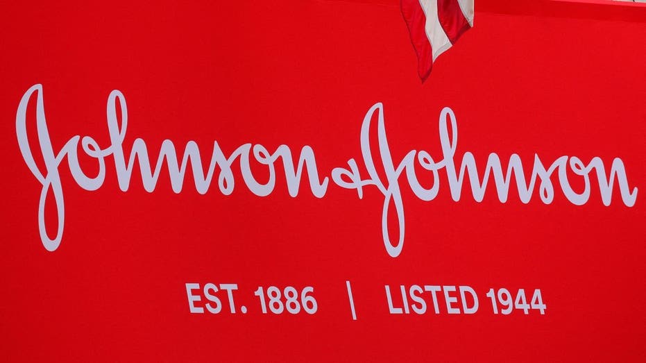
Johnson & Johnson is phasing out the classic cursive script logo it has used for about 130 years and was based on co-founder James Wood Johnson's signature. (Brendan McDermid / Reuters Photos)
"Our Johnson & Johnson brand identity communicates our bold approach to innovation in healthcare, while staying true to the care we have for our patients around the world," Vanessa Broadhurst, executive vice president of global corporate affairs, said in a release. "We take immense pride in leading healthcare for more than a century and are seizing on our scientific momentum to profoundly impact health for humanity."
| Ticker | Security | Last | Change | Change % |
|---|---|---|---|---|
| JNJ | JOHNSON & JOHNSON | 240.00 | +2.26 | +0.95% |
While the Johnson & Johnson logo is being updated, the color scheme will be similar. The company said it will continue using the color red and is "leaning into a refreshed, bright, and contemporary color that speaks to the ability to urgently respond to health challenges, evolve with the times and set the pace."
Johnson & Johnson's new logo moves away from the company's classic cursive script. (Courtesy of Johnson & Johnson / Fox News)
CORPORATE DIVERSITY POLICIES MAY FACE SCRUTINY AFTER SUPREME COURT’S AFFIRMATIVE ACTION RULING
The brand’s new logo will continue to feature an ampersand, although it, too, will be getting a refresh. Johnson & Johnson explained that "The new ampersand captures a caring, human nature. It now presents itself as a more globally recognized symbol and represents the openness of the brand, as well as the connections that bring the Company’s purpose to life."
Overall, the company views the revamped logo’s artistic style as infusing new energy into the brand while encapsulating Johnson & Johnson’s approach to fulfilling its health care mission.
GET FOX BUSINESS ON THE GO BY CLICKING HERE
"The elements in the art direction style – which include illustration, photography, and more – have been crafted to spark energy, optimism and inclusivity, all while offering a unique and distinctive approach in healthcare," Johnson & Johnson said.
The company said in its press announcement that the "new logo, colors and font will be rolled out across all company materials, product packaging, and branding assets over time."